When the brief is to make a portable toilet look cool, you'd better not bottle it
)
There's a particular kind of brief that separates the genuinely strategic designer from the merely decorative one. It's the brief where the product is brilliant, but the category is, let's say, challenging. Where the first instinct might be to reach for soft blues, clinical sans-serifs and the kind of reassuring language you'd find on a box of incontinence pads. Where playing it safe feels not just tempting, but almost defensible.
Lark Design Studio, a branding agency based in Leamington Spa, got exactly that brief when portable toilet startup Luii came knocking. And what they did with it is worth pulling apart, because the thinking is genuinely useful for any creative handed a project they aren't quite sure how to position.
The trap hiding in the brief
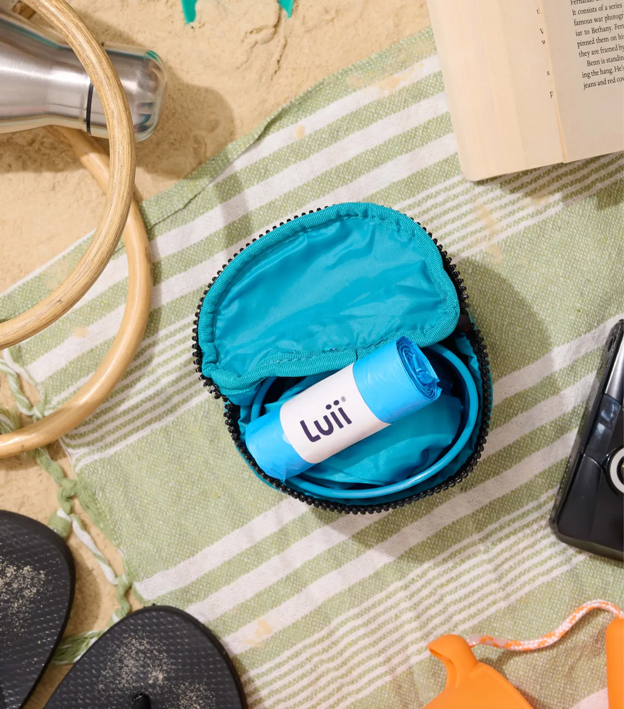
Luii makes a portable, pocket-sized toilet. It's a genuinely clever piece of product design, developed with Tone, the team behind homeware brand Joseph Joseph, and aimed squarely at anyone who's ever been caught short on a long hike, a festival site, a long motorway stretch, or somewhere else where the facilities are, shall we say, lacking. That's not a niche market. That's essentially everyone.

But here's where the trap lives: the moment you start designing for a product adjacent to continence, the gravitational pull of the healthcare aesthetic becomes almost irresistible.
The blues. The reassuring copy. The stock imagery of serene, relieved-looking people in sensible outdoor clothing. You know the look. It whispers "medical device" even when it's trying to say "lifestyle product."
Luii's founders knew this, which is why they came to Lark asking for something more. Not just a logo. A full visual and verbal identity that would position them as a consumer brand. Because, as the press release puts it with admirable directness: everybody pees, after all.
Shape-shifting
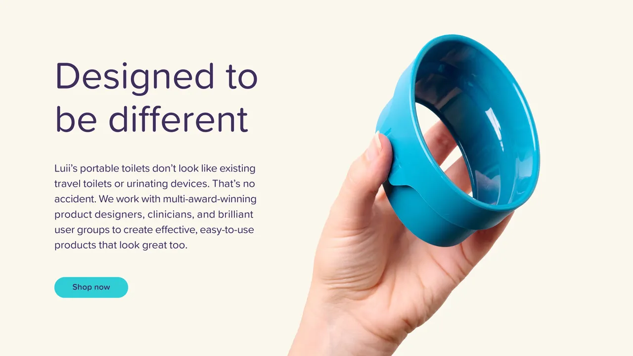
The smartest decision Lark made (and it's a decision that looks obvious in retrospect, which is the hallmark of good design thinking) was to root the entire identity in the product itself. Specifically, in the elliptical aperture that makes Luii's shape so distinctive.
That ellipse becomes the anchor for everything: icons, illustrations, patterns. It runs through the identity so consistently that even without the wordmark, you're seeing Luii.
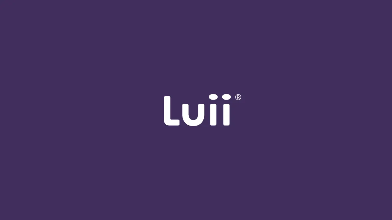
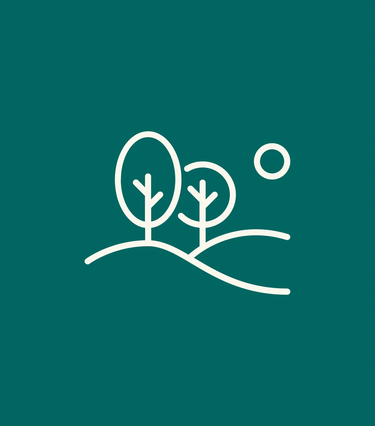
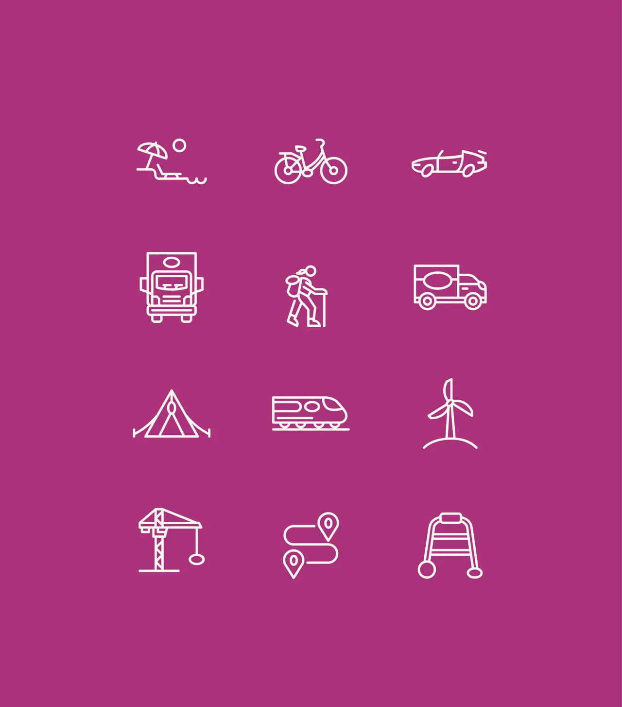
It's the kind of systematic thinking that elevates a brand from a nice logo to an actual visual language; one that scales, that's ownable, and that constantly reinforces the thing that makes the product special.
It also does something quietly clever: it makes the identity about design, not function. You're not being reminded what the product is for. You're being reminded how beautifully it's been made. That's a significant repositioning, achieved entirely through formal visual decisions.
Flushing out the colour brief
Colour was the other major battleground. Lark's solution—vibrant pops of purple, orange and green, with muted options for flex—is sector-defying in the best possible way. It sails the brand clean away from the medical sea of blue and plants it firmly in consumer territory.
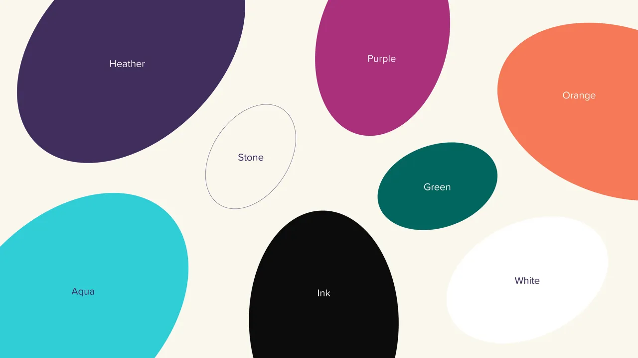
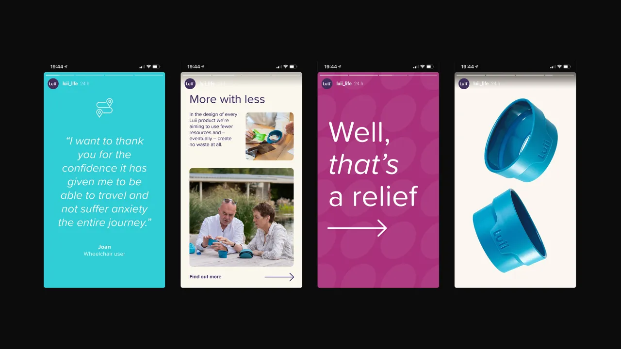
Think bold, think confident, think the kind of palette you'd find on a smart lifestyle product rather than a hospital waiting room.
This matters more than it might seem. Colour is one of the fastest, most instinctive signals a brand can send. Get it wrong, and you're fighting your own identity every time someone sees the packaging. Get it right, and it does half the positioning work before a single word is read.
The words do the rest
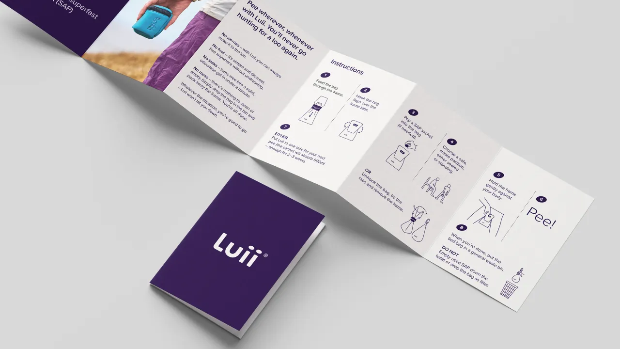
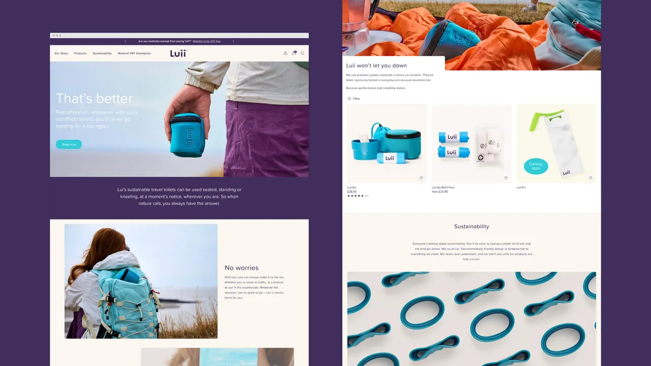
Crafted by copywriters Yarn, the verbal identity is equally well-judged: light, conversational, playful without being juvenile, matter-of-fact without being clinical.
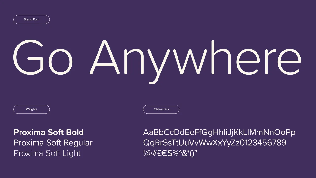
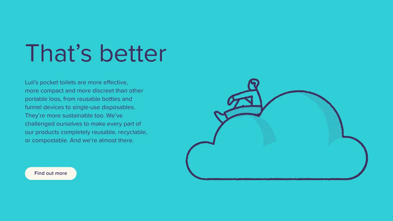
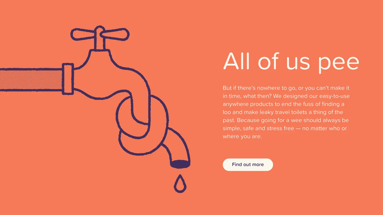
The strapline, 'Go anywhere', is doing about three things at once. It's a product promise, an adventure invitation, and a quiet, knowing nod to the whole business of needing to go. It earns its double meaning without ever being crass.
For any copywriter reading this, it's a reminder that the best lines aren't just clever. They're accurate. They capture the brand's entire reason for existing in two words.
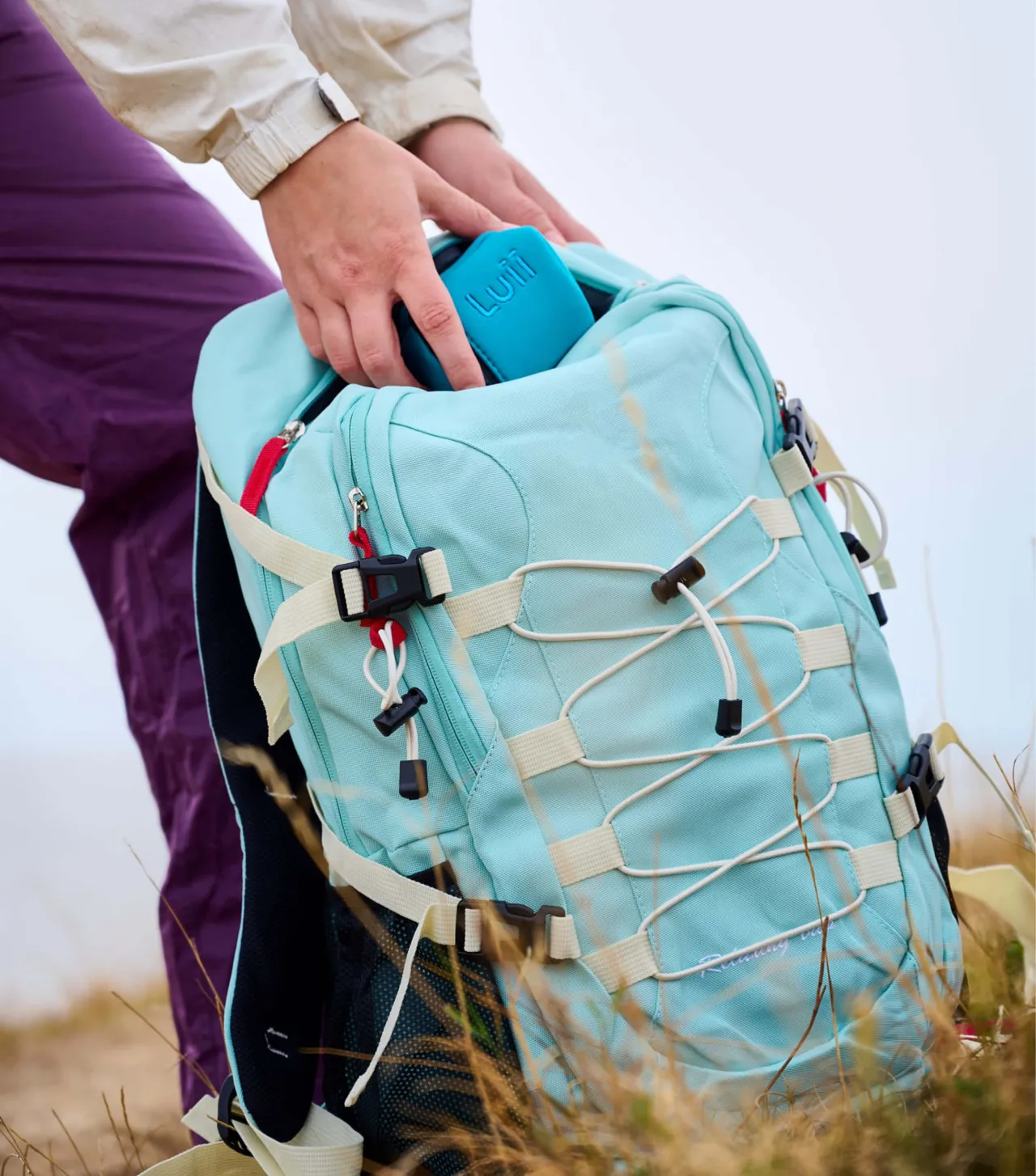
The supporting cast is equally considered. Illustrator Ryan Todd was commissioned to create witty assets that disarm the taboos around continence without trivialising them; no mean feat. Photography by Studio Lovely Jubley splits the difference between polished studio work that showcases the product's design credentials and looser, more evocative outdoor shots that put Luii in the wild.
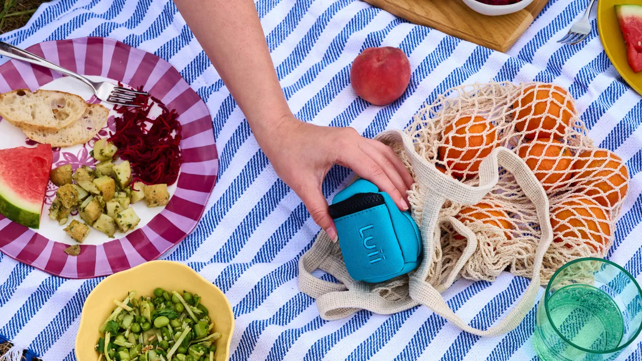
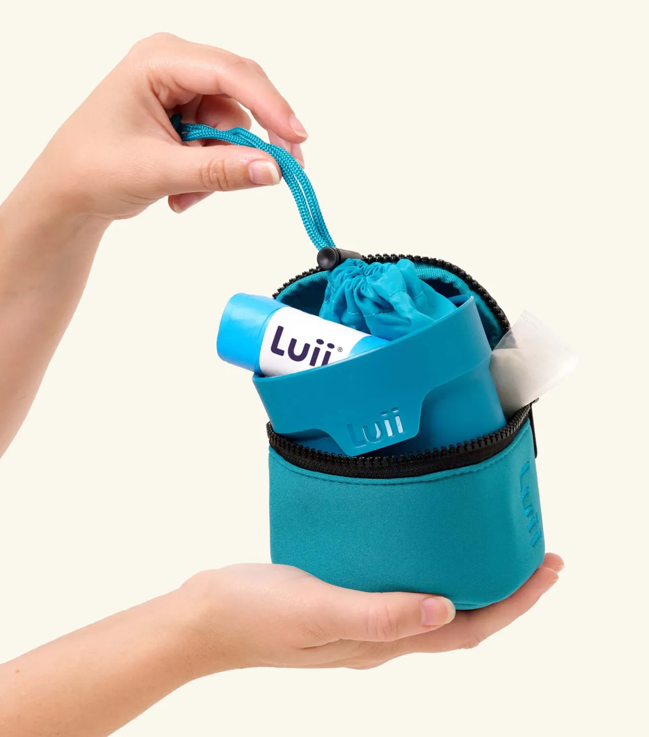
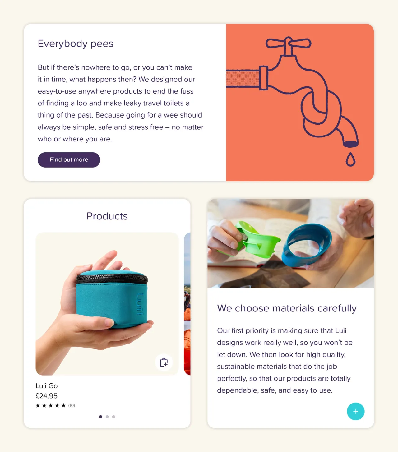
Together, they tell a coherent story about a product that belongs in your life, not your medicine cabinet.
Key takeaway
The real lesson from the Luii project isn't about portable toilets. It's about the courage to understand what a product actually is, not what its category says it should be... and design from there.
Luii isn't a healthcare device. It's a lifestyle product for curious, active people who want to go anywhere without worry. That insight changes everything: the colours, the typeface, the photography, the tone of voice, the whole lot. And sometimes the most important design decision you make is deciding not to be afraid of your own brief.