

Designing for Visibility: Lasting Colour and Contrast in Accessible Bathrooms
Age-related changes in vision can make shorter-wavelength blue-green hues
harder to distinguish. Warmer colours – yellow, orange and red - may remain
more recognisable and are sometimes described as ‘Lasting Colours’.
Yet colour alone is insufficient. Tonal contrast with the surrounding wall
or panel is equally important, particularly where contrast sensitivity is
reduced.
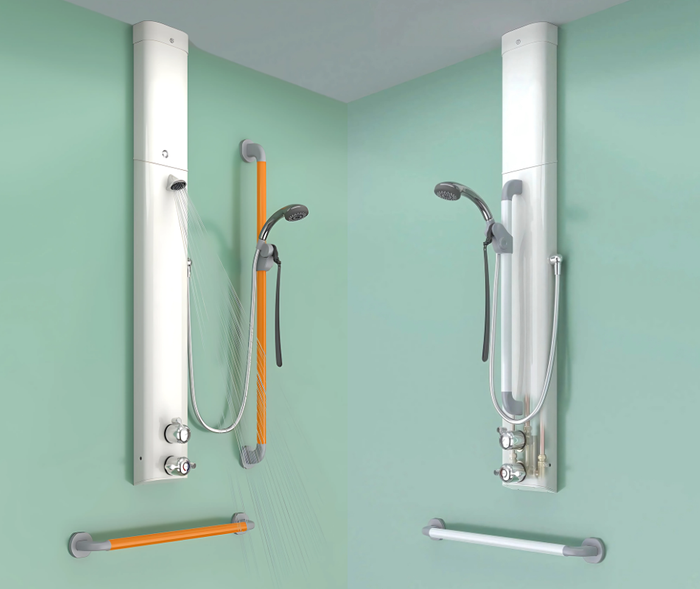
Horne’s shower riser/grab rails and separate 600mm support grab rails are
available in white (LRV 84) and deep orange (LRV 27). Against pale backgrounds,
deep orange can provide useful contrast, helping users locate a handhold or
adjust their shower.
Colour can also influence how welcoming or comfortable a bathroom feels,
making individual preferences and sensory needs important considerations. For
functional fittings, however, visibility is paramount. Horne’s deep-orange
rails combine the potential recognition benefits of a warm, longer-wavelength
‘Lasting Colour’ with strong tonal contrast against pale backgrounds –
addressing two aspects of visual accessibility rather than relying on contrast
alone.
Explore both options at Stand J50 at the Occupational
Therapy Show.